
Facebook Posts
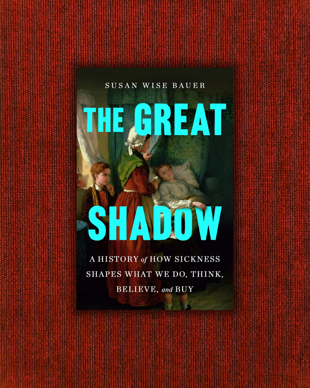
Today's Brave Writer podcast featured me! Go have a listen as Julie Bogart (one of my favorite people), Melissa Wiley (I just met her, she's lovely) and I discuss sickness, vaccines, pandemics, politics, pediatricians, and THE GREAT SHADOW.

[Podcast #362] Susan Wise Bauer and The Great Shadow - A Brave Writer's Life in Brief
blog.bravewriter.com
Susan Wise Bauer discusses her book, The Great Shadow, and the surprising ways illness has influenced everything from religion to politics.4 days ago
This strikes me as a peaceful way to push back against an administration that you disagree with: the Citizen Historians are photographing and documenting all of the current Smithsonian exhibitions, in case political pressure removes some of them and wipes the historical record of their existence.
I've been fairly critical on this page of people without historical training who call themselves historians. (David Barton, I'm looking at you.) But the Citizen Historians are volunteers who are simply creating a record that can survive the possibility of future purges.
What do you think of this effort?
From Brian Boucher's piece on Artnet.com:
**
When Donald Trump published an August 12 letter addressed to the secretary of the Smithsonian Institution, informing him of “a comprehensive internal review” of the shows and explanatory materials at the network of national museums, something snapped for historian James Millward. It was just a month after the president, on the pretext of a “public safety emergency” (and despite a historic low crime rate), had deployed the National Guard to the streets of Washington. D.C., where Millward is a history professor at Georgetown University. Many who opposed the president were desperate for something they could do to demonstrate their resistance, Millward said in a phone conversation...
Thus was born the idea for Citizen Historians for the Smithsonian, which has recruited hundreds of volunteers to document every gallery, every object, and every wall label at the Smithsonian Institution’s museums as a safeguard against politically motivated erasure or censorship.
That’s not an idle worry. Trump has singled out Smithsonian museums for criticism, posting in August on his Truth Social platform that he was ordering a review of museums’ displays, partly because, in his view, they have focused too much on “how bad Slavery was.” That same month, the National Museum of American History removed a placard describing Trump’s two impeachments, before reinstating it following an outcry. Earlier still, Amy Sherald pulled her solo show, “American Sublime,” from its stop at the National Portrait Gallery, citing censorship concerns...
“There’s a common approach of authoritarian governments to history,” he said. “I’m aware of efforts to shape the narrative—because culture wars are also narrative wars—in the media and social media. But institutions are also very much used by authoritarian powers to try to influence the world. One pushes back as one can...”
Millward teamed up with his colleague Chandra Manning, who teaches U.S. history and is director of the Georgetown Institute for Global History...Manning alerted him to Save Our Signs, a volunteer initiative by the Data Rescue Project that called on volunteers to preserve didactics at the country’s National Parks after the Secretary of the Interior called for Americans to report signs that “inappropriately disparage Americans past or living.”
...“The changes that scare me are changes of erasure, of editing out, of exclusion,” [Manning] said, or attempts “to substitute a narrative of uniformity and homage, and create a past that never existed and use that as a template for the present. If you can edit people and conflict and groups out of the past, that justifies editing them out of the present. If you can do that for one group, you can do it for anybody. Right now, it’s risky for everyone that doesn’t align with the president’s priorities, but it’s really risky for everyone.”
**
Read more at these links:
news.artnet.com/art-world/citizen-historians-document-smithsonian-museums-censorship-2693572
www.citizenhistorians.org/
thehoya.com/news/city-news/citizen-historians-document-smithsonian-fearing-censorship-efforts/

Citizen Historians Document Smithsonian Fearing Censorship Efforts
thehoya.com
Two Georgetown University history professors are leading a group of volunteers to archive exhibits across the Smithsonian Institution in anticipation of federal directives that could alter or remove museum content. The organization, Citizen Historians for the Smithsonian, was founded by Georgetown p...1 week ago
I think their work is important under any administration. As we’ve seen repeatedly, the pendulum swings widely (and sometimes wildly) as it overcorrects. So I wonder how dire the need is. The current administration will only be in place for two more years. Every administration “shapes the narrative” and to some degree influences “culture wars” (quoting Millward) to meet their particular political viewpoints. Since our political system doesn’t allow for “authoritarian governments” to exist unchecked or long-term, is the concern that displays and placards will be destroyed? 
What’s wrong with David Barton?
Hallelujah. I hope that future generations appreciate these efforts - both because of the work and because they can view it in the same “rear view mirrors” that we use when considering various other landmark turns of history.
This is great to hear! I had wondered if something like this was happening. If I lived in or near DC, I would absolutely sign up to help.
I think it’s our collective responsibility to document and remember. The studied historians can sort out the data later but only if it’s there to be looked at. I’m collecting banned books and history books for this reason
We have citizen scientists collecting data for scientists
I think the term citizen historians is pretty cool. It’s obviously borrowing from citizen scientists, which to me the point is that everyone knows these people are regular people, not scientists. I would think citizen historian has the same connotations. I participate in some crowd sourced projects that involve transcription of historical documents through the Library of Congress and the amazing thing about these efforts is how many people doing little parts can accomplish what would take a few people many decades to accomplish. I appreciate the efforts to preserve history.
I love the simple small ways individuals make a difference.
I think the project is interesting, and don’t see any problems with it, but I wonder how necessary it is? I haven’t been to any of the Smithsonian’s recently, but I assume that only a small percentage of the collection is on display at any given time. Most museums have some level of rotation, different featured exhibits, etc. If something is not currently on display, or removed from display, it doesn’t necessarily mean that it is gone forever.
I almost thought I was reading the story of how Zuckerberg admitted to being pressured by the Biden administration in direct violation of the 1st Amendment to censor Facebook during Covid
I admit that as a young parent I was influenced by a video of Barton"s shown at my church. I came home and told my husband we had to keep away from the schools that would teach our perfect impressionable children liberal history! 🐔 🌰 😜 So we began to homeschool the next year. While I am grateful for the years I spent with my children, I am equally thankful to have been blessed with a little more discernment as time went on. I remember reading the first chapter of a beginning chapter book about George Washington that was part of a boxed curriculum and it making me physically ill. It showed native peoples in a very negative light...as if this group of fellow human beings encountered in a forest were not human at all. I'm glad my children know better than I did.